REACH Delivery - Manage Receipt Definitions
This is an Administrator
only function available from the "Administrator
Functions" -> "Advanced Settings" menu.
The manage receipts options allows you
to add new receipts or to manage your existing receipts.
The following screen shows any receipts that are
available. Next to each receipt name are options to
select, delete, edit and display the receipt.
If receipts exist and this screen is
accessed from the send message function then the
additional options, show below,
to use the default or a manual receipt for the specific
message being sent are offered for selection.
Add
a New Receipt
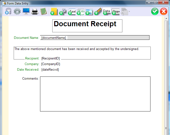
When you are creating a new receipt the following screen
is displayed. This is the REACH Delivery form builder the
Icons along the top will help with building the new
receipt. Please see below for details of the icon
functions.
What do the symbols mean?
(click on the icon or the link to jump to information on
that subject)
Before you start, be warned, the
icon will exit without saving your work. In
order to save your form you must click on the
icon to exit if you want to save your form and upload
the changes.
The following descriptions indicate what the different
functions in the REACH Delivery form builder do. However,
the best way to learn the form builder is to simply
start using it and try out the different options and
components. Don't forget that "right click" will
provide all the options for an element that you create.
Save form definition - saves the form that you
have been creating/modifying
Printer config - sets up the margins, paper size
and other standard page definitions
Print Preview - provides a standard print preview
function that displays the form as it will be printed
Print - standard print function that will print
the form to a printer on your network
Create demo form - Not sure where to start ? the
create demo form function will provide a demonstration
form for you to modify
Create new form - creates a new blank form to start
from
Add
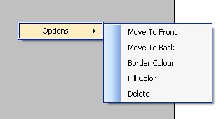
shaded area - tool to allow you to create a shaded
box. When you have created this box ofrany other
element then right click on it and an options menu will
come up (see right) that provides standard functions for
managing the component you have clicked on.
Add
check box - tool to add a standard check box
Add
text box - tool to allow you to create a text box.
When you have created this box or any other element then
right click on it and an options menu will come up that
provides standard functions for managing the component
you have clicked on.
Add Text Block - tool to add a pre-formatted text
block in which the text will automatically wrap.
Add Image - adds an image from a file on your
computer or network
Add Horizontal Rule - adds a horizontal line
across the form that you can move to where ever you need
on the form
Add Data Pair - tool to add a form field that is the
label and the data text.
Add
Combo Box - tool to add drop down pre-populated
field
Go To Main Help Page
|